Concept snapshot
Record date: May 27, 2026. Technology and screenshots describe the prototype as documented on this date. Any performance observations belong to the same point-in-time record. No current client deployment is implied.Overview
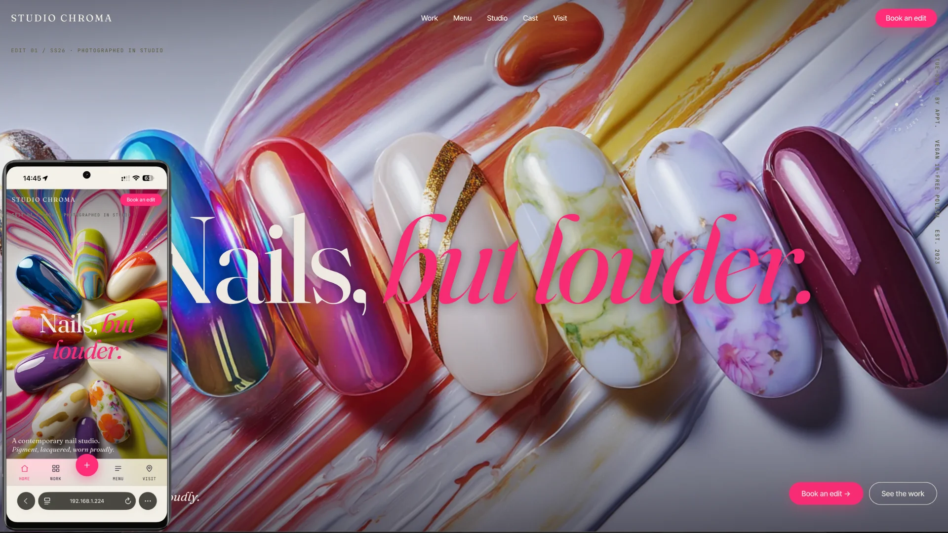
Studio Chroma is a portfolio-grade website for a contemporary nail studio that treats nails as wearable art. The design language borrows from fashion editorial and contemporary gallery exhibition — confident, saturated, and deliberately bold. Every section rotates through a distinct "Lacquer Pop" color palette so that scrolling the site feels like turning the pages of a lookbook.
The copy reads like exhibition wall labels, not salon brochures: "Edit 01: Chrome." "Pigment, lacquered. Worn proudly." The tone is terse, art-critic adjacent, and unapologetically premium.
Built entirely in vanilla HTML, CSS, and JavaScript with no build step, the site demonstrates that Awwwards-class motion design and interaction can be achieved with fundamental web technologies.
Live Demo: https://studiochroma.apalaugonzalez.com/
Key Features
Kinetic Typography & Marquees
- Split-text hero headline — "Nails, but louder." with word-by-word staggered reveals using GSAP SplitText
- Infinite kinetic marquees — Auto-scrolling editorial labels ("NEW / SS26 / ART") that reverse direction on hover
- Rotating sticker badges — Inline SVG <textPath> elements spinning continuously to mark seasonal edits
Color-Wash Scroll Transitions
- Section-level color blocking — Each fold of the site is drenched in a distinct hero pigment: magenta, coral, lime, cobalt, lavender, or plum
- Scroll-driven color washes — GSAP ScrollTrigger choreographs smooth background color transitions as the user moves down the page
- High-contrast inversion — Navigation, logo, and typography automatically invert to maintain legibility over saturated backgrounds
Drag-to-Scroll Gallery
- Horizontal museum rail — A drag-to-scroll gallery of 23 curated nail looks, organized by filter chips: All, Chrome, Art, Color
- GSAP Draggable integration — Smooth inertia-based scrolling with boundary constraints
- Lightbox viewing — Full-screen image modal with keyboard navigation for inspecting detail work
Custom Blob Cursor
- Organic follow cursor — A morphing blob shape that trails the mouse with damped physics on desktop
- State changes — Cursor shifts color and scale when hovering interactive elements (buttons, gallery items, links)
- Disabled on touch devices — Falls back to native cursor for mobile and tablet
Studio & Team
- Color-blocked team portraits — Six team members photographed against solid pigment backdrops (magenta, coral, lavender, cobalt, plum, lime)
- Studio interior — Gallery-like space with a magenta feature wall and rainbow polish display
- Editorial bios — Terse, confident copy that positions artists as creators, not service providers
Booking Experience
- Full-screen multi-step booking takeover — Service selector, date and time picker, artist preference, and notes
- Bottom sheet modals on mobile — Native-app feeling sheets that slide up from the tab bar
- Form validation — Real-time validation with visual feedback states
Mobile PWA
- Installable progressive web app — Service worker, web manifest, and offline fallback
- Bottom tab bar — Persistent native-style navigation (Studio, Gallery, Book, Contact) with animated highlight indicator
- Edge-to-edge color — Sections bleed to the viewport edges with safe-area-inset awareness
- Sheet modals — Bottom-sheet pattern for booking, contact, and menu on small screens
Technology Stack
Core
- Vanilla HTML5 — Semantic structure with ARIA labels and roles
- Vanilla CSS3 — CSS custom properties for the "Lacquer Pop" design-token system, modern layout primitives, and scroll-driven color transitions
- Vanilla JavaScript (ES modules) — Module-pattern entry point with feature detection and progressive enhancement
Animation & Interaction
- GSAP + ScrollTrigger + SplitText — Production-grade scroll-driven animations, text reveals, and section choreography
- GSAP Draggable — Inertia-based horizontal gallery scrolling
- Lenis — Smooth scroll with custom easing for a weighted, fluid feel
- Splitting.js — Character-level typography animations for marquee and hero effects
Design
- Lacquer Pop Palette — Saturated, deliberate pigments: magenta, coral, lime, cobalt, lavender, and plum against cream and ink
- Typography — Fraunces 144 opsz for display headlines, paired with a clean geometric sans for body copy
- Responsive Breakpoints — Mobile-first with dedicated tablet and desktop treatments
- ** prefers-reduced-motion** — Respects system motion preferences with instant-visibility fallbacks
Technical Highlights
Performance Optimizations
- Zero build step — Direct file serving with no bundler overhead
- WebP image delivery — All photography and gallery assets in WebP with loading="lazy"
- GPU-accelerated animations — will-change and transform3d hints on motion-heavy elements
- Minimal dependency footprint — Only GSAP ecosystem and Lenis loaded from CDN
PWA Architecture
- Service worker — Caches static assets for offline browsing
- Web app manifest — Installable on iOS and Android home screens
- Theme-aware meta tags — theme-color responds to prefers-color-scheme with cream and ink variants
Accessibility Considerations
- ARIA labels — Navigation, gallery, mobile menu, and booking modal properly labeled
- Keyboard navigation — Gallery lightbox supports Escape and arrow keys; booking form is fully keyboard accessible
- Focus management — Mobile menu and booking takeover trap focus appropriately
- Reduced motion — prefers-reduced-motion: reduce disables marquees, cursor effects, and scroll animations
Project Structure
studio-chroma/
├── index.html
├── manifest.webmanifest
├── service-worker.js
├── css/
│   ├── tokens.css          # Lacquer Pop design tokens
│   ├── base.css            # Reset, typography, layout primitives
│   ├── components.css      # Buttons, chips, cursor, modal, sheet, tab bar
│   ├── sections.css        # Per-section styles and color blocks
│   └── animations.css      # Keyframes and motion presets
├── js/
│   ├── main.js             # Entry point and feature inits
│   ├── lenis.js            # Smooth scroll
│   ├── cursor.js           # Custom blob cursor
│   ├── animations.js       # GSAP choreography
│   ├── marquee.js          # Kinetic infinite marquees
│   ├── nav.js              # Sticky nav + mobile tab bar
│   ├── sheet.js            # Bottom sheet modal controller
│   ├── gallery.js          # Drag-to-scroll gallery + lightbox
│   ├── booking.js          # Full-screen booking takeover
│   └── pwa.js              # Service worker registration
└── assets/
    ├── general/            # Hero, services, studio, team, map
    └── gallery/            # 23 curated nail looks
Challenges and Solutions
Challenge: Saturated Color Blocks Without Visual Fatigue
Solution: Established a strict rhythm — every color section is separated by a cream "breath" zone. The palette was intentionally limited to five hero pigments plus neutral canvas/ink, ensuring collisions feel curated rather than chaotic. Text and UI elements invert automatically via CSS custom properties tied to each section's background.
Challenge: Native-App Feel on Mobile Without a Framework
Solution: Built a custom bottom tab bar, sheet modal system, and safe-area-aware layout entirely in vanilla CSS and JS. The tab bar uses a sliding highlight indicator driven by intersection observers, and sheet modals animate with CSS transitions and dynamic viewport unit calculations.
Challenge: Horizontal Gallery with Drag, Inertia, and Filtering
Solution: Combined GSAP Draggable for the drag-and-inertia physics with a custom filtering system that toggles visibility classes on gallery items. When the filter changes, the scroll position resets and items re-animate with staggered reveals.
Challenge: Custom Cursor That Does Not Break Accessibility
Solution: The blob cursor is rendered as a fixed-position element following the mouse via damped requestAnimationFrame loops. It is hidden entirely on touch devices and does not interfere with native focus indicators or screen-reader interaction.
Key Learnings
- Editorial Tone for Service Businesses: Learned to write copy that reads like a fashion publication rather than a local business brochure — a technique that elevates perceived value significantly
- Color-First Design: Built an entire experience around a saturated palette, treating each pigment as a "chapter" rather than an accent
- Vanilla JS at Scale: Managed complex interaction state (cursor, gallery, booking, marquees, nav, sheets) without a framework by using a disciplined module pattern and feature detection
- PWA Patterns for Content Sites: Implemented installability, offline caching, and native-app UI patterns for a static marketing site
- Gallery UX: Designed a drag-to-scroll horizontal museum rail that feels tactile on desktop and translates naturally to swipe on mobile
Live Demo
Experience the full editorial journey — from the kinetic hero and color-wash scroll transitions to the drag-to-scroll gallery, team portraits, and native-app booking experience:
Outcome
Studio Chroma demonstrates the ability to craft a bold, gallery-inspired brand experience for the beauty and fashion industry using only fundamental web technologies. It showcases skills in:
- Editorial Visual Design — A saturated, art-critic aesthetic with disciplined color blocking
- Advanced Motion Design — GSAP-powered kinetic typography, scroll-driven color transitions, and infinite marquees
- Custom Interaction — Blob cursor, drag-to-scroll gallery, and bottom-sheet modals
- Progressive Web App — Installable, offline-capable, with native-app mobile UX
- Accessibility — Reduced-motion support, keyboard navigation, and semantic HTML
The site serves as a portfolio piece highlighting taste, confidence, and technical range — from the first kinetic headline to the final booking confirmation.